Niche analysis with CellMapper and Sopa#
This tutorial shows how CellMapper can be used to enrich latent spaces with spatial context to identify tissue niches, following the principles of UTAG [KRM+22] and CellCharter [VTSMartinez+24]. We also show how Sopa [BMG+24] can be used to perform downstream analysis, following their niche tutorial.
Preliminaries#
Import packages & data#
import scanpy as sc
import sopa
import matplotlib.colors as mcolors
from matplotlib.gridspec import GridSpec
import networkx as nx
from community import community_louvain
from netgraph import Graph
import torch

import numpy as np
import scvi

import squidpy as sq
import matplotlib.pyplot as plt
import seaborn as sns
import warnings
from cellmapper import CellMapper

import pandas as pd
sc.set_figure_params(scanpy=True, frameon=False, fontsize=10)

# some torch and scvi-tools settings
torch.set_float32_matmul_precision("high")
scvi.settings.dl_num_workers = 10  # will depend on your system
scvi.settings.dl_persistent_workers = True

MODEL_DIR = "models/scvi_mouse_organogenesis"
ACCELERATOR = "mps" if torch.backends.mps.is_available() else "auto"  # when runnign locally on Apple Silicon
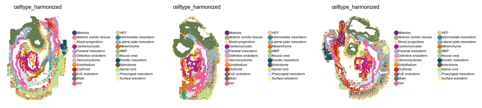
Load the seqFISH data of [LGM+22], which profiles mouse embryogenesis at approximately embryonic day (E) 8.5.
adata = sc.read("data/spatial_data.h5ad", backup_url="https://figshare.com/ndownloader/files/54145250")
adata
AnnData object with n_obs × n_vars = 51787 × 351
    obs: 'embryo', 'pos', 'z', 'embryo_pos', 'embryo_pos_z', 'Area', 'celltype_seqfish', 'sample_seqfish', 'umap_density_sample', 'modality', 'total_counts', 'n_counts', 'celltype_harmonized'
    uns: 'celltype_harmonized_colors', 'celltype_seqfish_colors', 'embryo_colors', 'pca', 'umap'
    obsm: 'X_pca', 'X_umap', 'X_umap_orig', 'spatial'
    varm: 'PCs'
Basic preprocessing#
adata.layers["counts"] = adata.X.copy()

sc.pp.normalize_total(adata, target_sum=1e4)
sc.pp.log1p(adata)
Basic visualization#
Let’s take a closer look at this dataset before we get started.
with warnings.catch_warnings():
    warnings.simplefilter("ignore")

    with plt.rc_context({"figure.figsize": (2, 2.5), "legend.fontsize": 5, "axes.titlesize": 8}):
        sq.pl.spatial_scatter(
            adata,
            library_key="embryo",
            color="celltype_harmonized",
            shape=None,
            wspace=0.8,
        )
Compute a joint embedding#
For our niches to be shared across the different embryos, let’s compute a joint embedding using scVI [LRC+18] while correcting for the embryo batch label. This is a similar principle to the published CellCharter [VTSMartinez+24] method - we first compute a joint latent space across samples, which we will later on use for spatial contextualization.
For me, this takes around 10 min on an RTX 4090 or 15 min locally on my M2 MacBook Pro.
scvi.model.SCVI.setup_anndata(adata, layer="counts", batch_key="embryo")
Train the model (I’m using a pre-trained model below, uncomment to train from scratch)
# vae = scvi.model.SCVI(adata, gene_likelihood="nb", accelerator=ACCELERATOR)

# vae.train(early_stopping=True)
# vae.save(dir_path=MODEL_DIR, overwrite=True)
Optionally, load a pre-trained model
vae = scvi.model.SCVI.load(MODEL_DIR, adata=adata, accelerator=ACCELERATOR)
INFO File models/scvi_mouse_organogenesis/model.pt already downloaded
Retrieve the scVI latent space
adata.obsm["scVI"] = vae.get_latent_representation()
Let’s compute a UMAP in this joint latent space to visually convince us that samples are integrated.
sc.pp.neighbors(adata, use_rep="scVI")
sc.tl.umap(adata, key_added="X_umap_scVI")
sc.pl.embedding(adata, basis="umap_scVI", color=["embryo", "celltype_harmonized"])
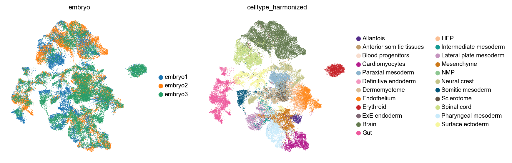
Looks good visually (we could evaluate this now more quantitatively using scIB metrics [LButtnerC+22]).
Work with CellMapper#
Prepare spatial graph and CellMapper object#
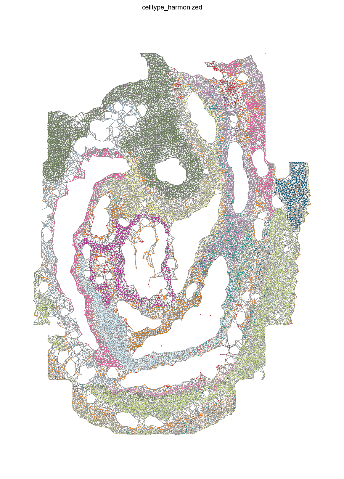
First, we need to compute a graph of neighborhood relatinships in space. For that, we can use squidpy. We’ll use delaunay triangularization, to avoid having to pass a dataset-dependent radius, with a percentile specified to remove long-range connections. Also, we stratify by embryo, to make sure that cells can only have neighbors in their own coordinate system.
sq.gr.spatial_neighbors(
    adata,
    coord_type="generic",
    library_key="embryo",
    spatial_key="spatial",
    delaunay=True,
    percentile=98,
)

mean_n_neighbors = np.sum(adata.obsp["spatial_connectivities"] != 0, axis=1).mean()
print(f"On average, each cell has {mean_n_neighbors:.2f} neighbors in space.")
INFO     Creating graph using `generic` coordinates and `None` transform and `3` libraries.
On average, each cell has 5.86 neighbors in space.
Let’s take a look at this graph in one example embryo.
with warnings.catch_warnings():
    warnings.simplefilter("ignore")

    sq.pl.spatial_scatter(
        adata,
        color="celltype_harmonized",
        library_key="embryo",
        library_id="embryo1",
        shape=None,
        size=1,
        connectivity_key="spatial_connectivities",
        edges_width=0.5,
        legend_loc=None,
        figsize=(10, 10),
    )
Initialize CellMapper in self-mapping mode, by providing only a single dataset.
smap = CellMapper(adata)
smap
INFO Initialized CellMapper for self-mapping with 51787 cells.
CellMapper(self-mapping, data=AnnData(n_obs=51,787, n_vars=351),
Load pre-computed spatial neighborhood graph.
smap.load_precomputed_distances("spatial_distances")
INFO     Created Neighbors object from distances matrix with 51787 cells
INFO     Loaded precomputed distances from 'spatial_distances' with 51787 cells and 12 neighbors per cell.
Smooth embedding over spatial coordinates.#
Compute a mapping matrix - we’ll give equal weight to neighboring cells. We could use any other CellMapper kernel function here.
smap.compute_mapping_matrix(kernel_method="equal")
INFO Computing mapping matrix using kernel method 'equal'.
To contextualize the latent space, we simply perform a matrix multiplication with our mapping matrix, which corresponds to a normalized version of the (embryo-stratified) spatial graph.
smap.map_obsm(key="scVI", prediction_postfix="_spatial")
INFO     Mapping embeddings for key 'scVI' using direct multiplication
INFO     Embeddings mapped and stored in query.obsm['scVI_spatial']
Cluster smoothed expression to obtain niches#
There are plenty of niche identification algorithms out there by now, and most of them operate by somehow contextualize each cell’s expression profile in its local microenvironment, to obtain a more aggregate view of the tissue at hand. Examples include UTAG [KRM+22], CellCharter [VTSMartinez+24], NicheCompass [BBPardasF+25], SEDR [XFL+24], BayesSpace [ZSR+21] and STAGATE [LBC+24], among many others.
We did the simplest version of that above, so let’s see what we get when we cluster cells in this spatially contextualized scVI latent space.
sc.pp.neighbors(adata, use_rep="scVI_spatial")
sc.tl.leiden(adata, flavor="igraph", n_iterations=2, resolution=0.1, key_added="niche")

if "niche_colors" in adata.uns:
    del adata.uns["niche_colors"]
How do these niches co-localize with cell type annotations in the UMAP?
with plt.rc_context({"figure.figsize": (2, 3), "legend.fontsize": 6, "axes.titlesize": 8}):
    sc.pl.embedding(adata, basis="umap_scVI", color=["embryo", "niche", "celltype_harmonized"])
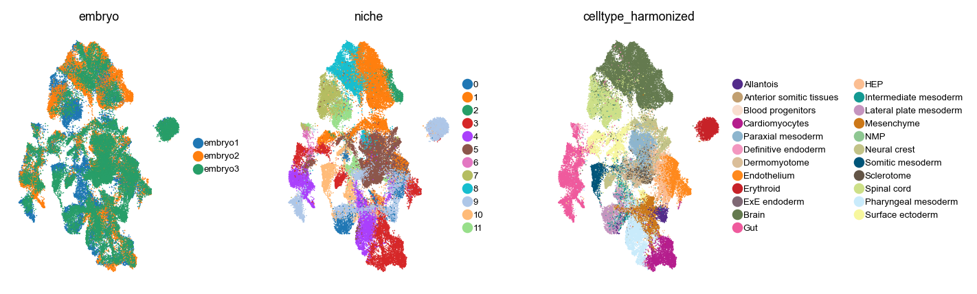
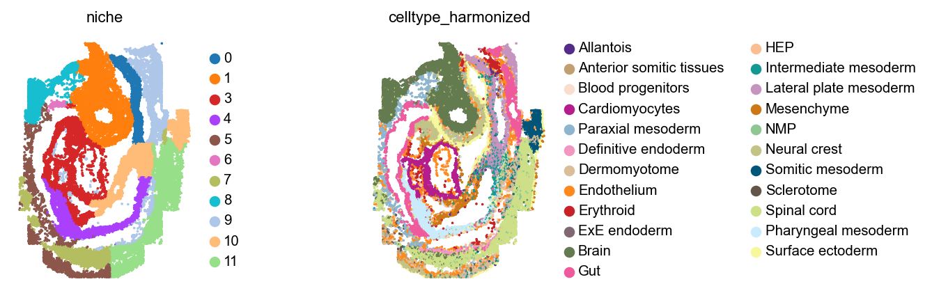
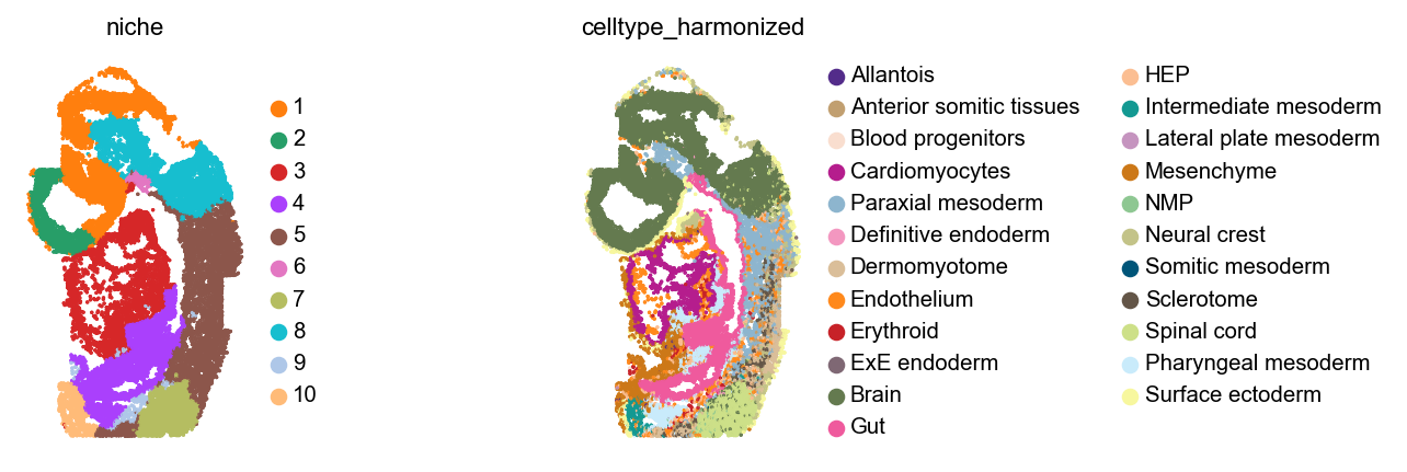
Let’s plot these niches across embryos, alongside cell type annotations.
with warnings.catch_warnings():
    warnings.simplefilter("ignore")

    for library_id in adata.obs["embryo"].cat.categories:
        sq.pl.spatial_scatter(
            adata,
            library_key="embryo",
            library_id=library_id,
            color=[
                "niche",
                "celltype_harmonized",
            ],
            shape=None,
            size=1,
            figsize=(4, 3),
            wspace=0,
        )

plt.show()

Analyze niches#
How are these niches related to cell types, across the different embryos? Are these niches really consistent across embryos?
cats = adata.obs["embryo"].cat.categories

# Set up figure
fig = plt.figure(figsize=(len(cats) * 4, 6))
gs = GridSpec(1, 3, width_ratios=[1.1, 1, 1.3])  # Give more space to first and last subplots

# Create axes with the custom grid
axes = [plt.subplot(gs[0, i]) for i in range(3)]

for i, (ax, cat) in enumerate(zip(axes, cats, strict=False)):
    obs_mask = adata.obs["embryo"] == cat
    mat = pd.crosstab(adata[obs_mask].obs["niche"], adata[obs_mask].obs["celltype_harmonized"])
    mat = mat.div(mat.sum(axis=1), axis=0)

    # Only show colorbar for the last subplot
    cbar = True if i == len(axes) - 1 else False

    # Adjust colorbar width to make it narrower
    cbar_kws = {"label": "Fraction cells in Niche"}
    if cbar:
        cbar_kws["shrink"] = 0.8  # Make the colorbar slightly shorter than the plot

    ax = sns.heatmap(mat.T, ax=ax, cbar=cbar, cbar_kws=cbar_kws)
    ax.set_title(cat)

    # Only show y-tick labels for the first subplot
    if i > 0:
        ax.set_ylabel("")
        ax.set_yticklabels([])

plt.tight_layout()
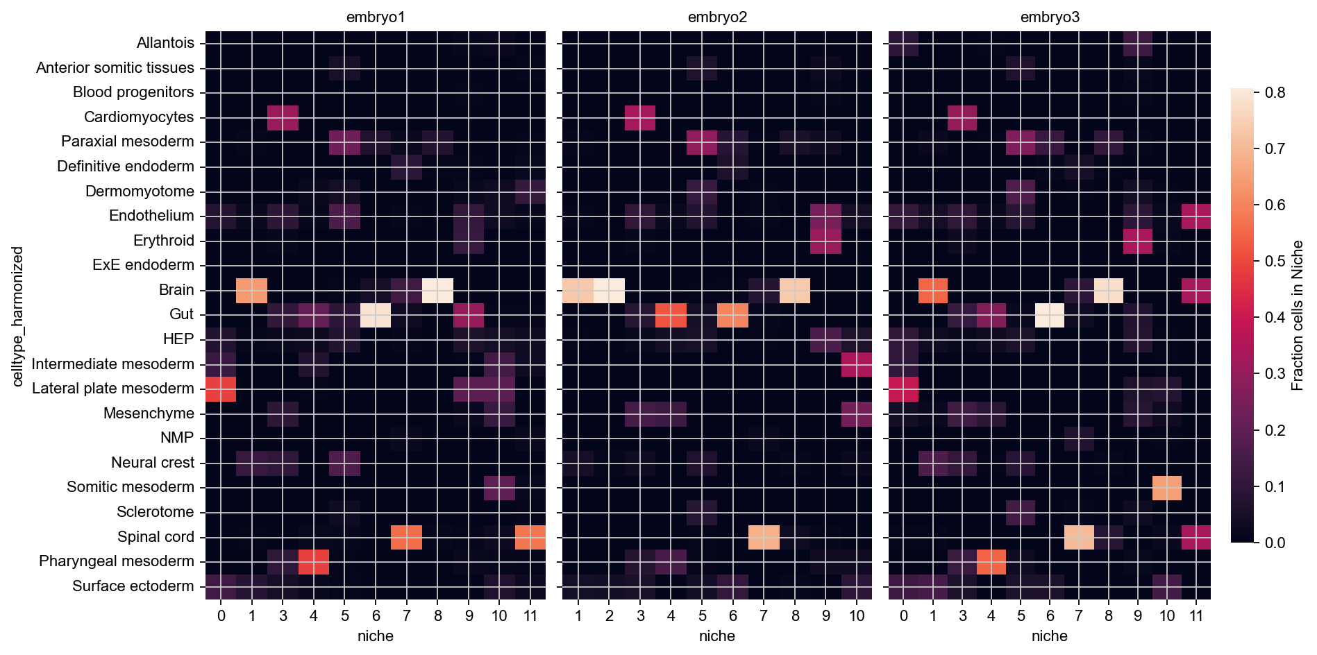
These niches look mostly consistent - for example, across all embryos, 11 and 12 are brain niches, 5 corresponds to spinal cord, and 1 contains mostly cardiomyocytes with some gut and some neural crest cells.
Look into niche geometries#
To gain further insights into the niches identified here, we can use Sopa [BMG+24]. The remainder of this tutorial will closely follow Sopa’s tutorial on Niche analysis. To simplify things, let’s focus on just a single embryo from here on.
bdata = adata[adata.obs["embryo"] == "embryo1"].copy()
First, we can compute the mean distance between cell types and niches.
cell_type_to_niche = sopa.spatial.mean_distance(
    bdata,
    "celltype_harmonized",
    "niche",
)

plt.figure(figsize=(5, 6))
sns.heatmap(cell_type_to_niche, vmax=40, cmap=sns.cm.rocket_r, cbar_kws={"label": "Mean hop distance"})
plt.show()
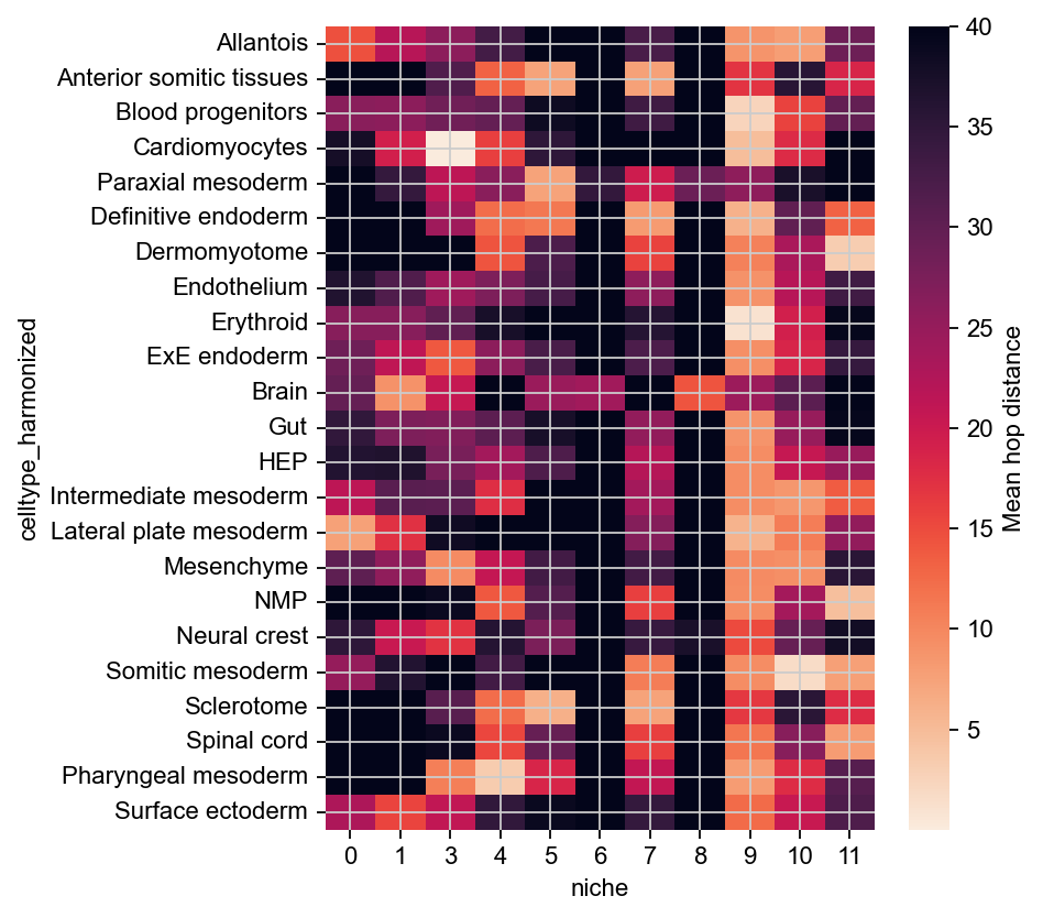
This confirms that niches 10 and 11 localize with Brain cells, and to varying degrees with Paraxial mesoderm and Lateral plate mesoderm. (Note that we flipped the colormap here, as small distance means more association).
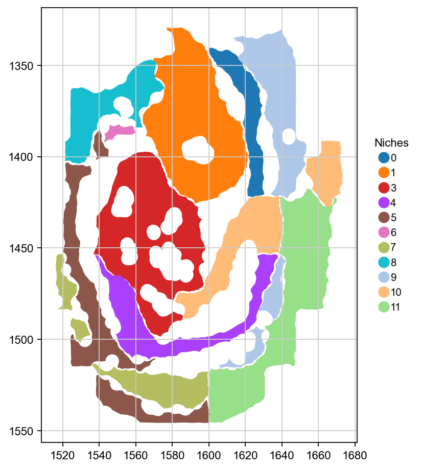
For further analysis, let’s vectorize niches as shapely polygons.
gdf = sopa.spatial.vectorize_niches(bdata, "niche")

# sort categories
gdf["niche"] = gdf["niche"].astype("category")
sorted_cats = sorted(gdf["niche"].cat.categories, key=lambda x: int(x))
gdf["niche"] = gdf["niche"].cat.reorder_categories(sorted_cats)

gdf.head()
| geometry | niche | length | area | roundness | |
|---|---|---|---|---|---|
| 0 | POLYGON ((1599.858 1340.817, 1599.861 1340.905... | 0 | 200.845549 | 745.707693 | 0.232303 |
| 1 | POLYGON ((1564.043 1377.16, 1564.027 1377.252,... | 1 | 324.437298 | 3096.294437 | 0.369650 |
| 2 | POLYGON ((1652.895 1406.676, 1652.895 1406.766... | 10 | 100.153691 | 494.290788 | 0.619239 |
| 3 | POLYGON ((1581.291 1479.259, 1581.361 1479.305... | 10 | 226.066042 | 1204.317742 | 0.296129 |
| 4 | POLYGON ((1599.414 1532.222, 1599.467 1532.29,... | 11 | 383.118706 | 2743.068403 | 0.234844 |
Each connected component of each niche is represented here as one polygon. Let’s plot these in space.
legend_kwds = {
    "bbox_to_anchor": (1.04, 0.5),
    "loc": "center left",
    "borderaxespad": 0,
    "frameon": False,
    "title": "Niches",
}

# make colors consistent with what we had above
niche_to_color = dict(zip(bdata.obs["niche"].cat.categories, bdata.uns["niche_colors"], strict=False))
niche_cmap = mcolors.ListedColormap([niche_to_color[cat] for cat in gdf["niche"].cat.categories])

ax = gdf.plot(column="niche", legend=True, cmap=niche_cmap, legend_kwds=legend_kwds, figsize=(7, 7))
ax.invert_yaxis()  # Flip the y-axis, to match our other plots above
plt.show()
Let’s use sopa to compute simple geometric properties of each one of these niches, across embryos.
df_niche_geom = sopa.spatial.niches_geometry_stats(bdata, "niche")

df_niche_geom.index = df_niche_geom.index.astype(int)
df_niche_geom = df_niche_geom.sort_index()
Visualize these properties.
fig, axes = plt.subplots(1, 4, figsize=(8, 6))

for i, name in enumerate(["n_components", "length", "area", "roundness"]):
    vmax = df_niche_geom[name].sort_values()[-2:].mean()

    ax = sns.heatmap(
        df_niche_geom[[name]],
        cmap="viridis",
        annot=True,
        fmt=".2f",
        vmax=vmax,
        ax=axes[i],
        cbar=False,
    )

    # Only show y-tick labels for the first subplot
    if i > 0:
        ax.set_ylabel("")
        ax.set_yticklabels([])

plt.subplots_adjust(wspace=0.3)
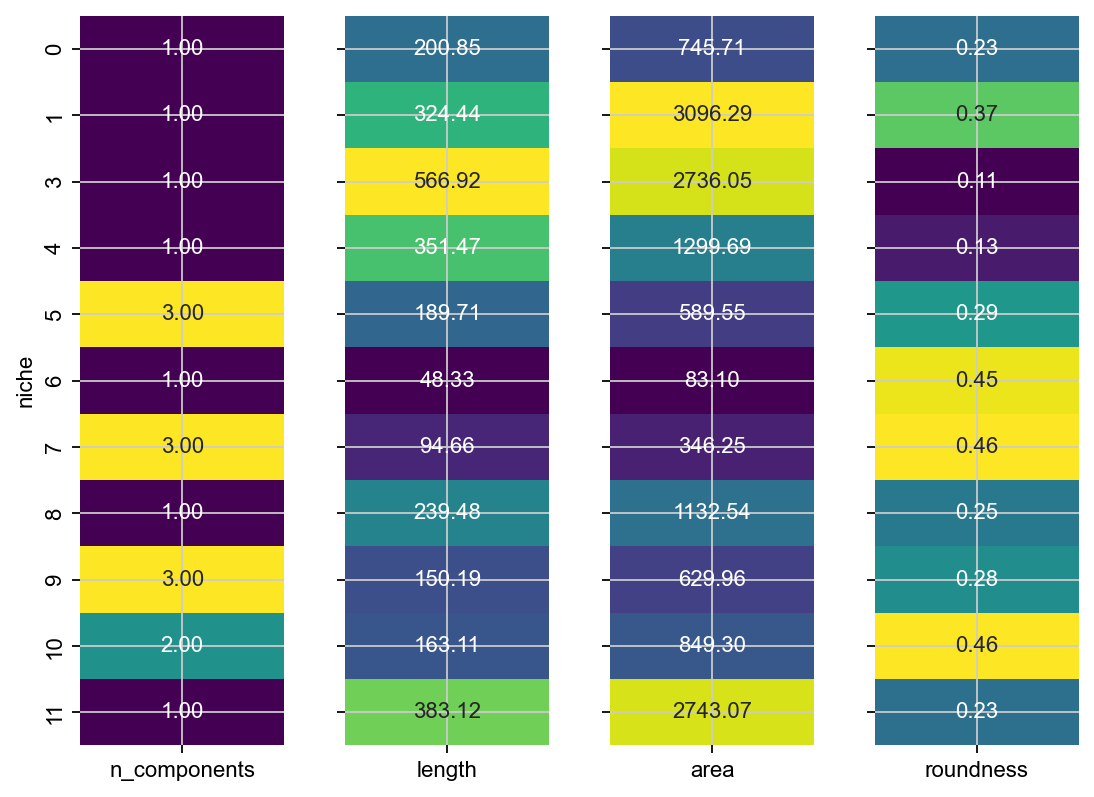
This confirms what we can see - e.g. niche 3 appears twice in this sample, niche 1 is the longest and the largest and niche 14 is relatively round.
Compute a cell type to Niche network#
Visualize a graph to gain a more global understanding of the relationship between niches and celltypes. Under the hood, Sopa uses Netgraph for the visualization.
weights, node_color, node_size, node_shape = sopa.spatial.prepare_network(bdata, "celltype_harmonized", "niche")
g = nx.from_pandas_adjacency(weights)
node_to_community = community_louvain.best_partition(g, resolution=1.35)
plt.figure(figsize=(10, 10))

Graph(
    g,
    node_size=node_size,
    node_color=node_color,
    node_shape=node_shape,
    node_edge_width=0,
    node_layout="community",
    node_layout_kwargs={"node_to_community": node_to_community},
    node_labels=True,
    node_label_fontdict={"size": 6, "weight": "bold"},
    edge_alpha=1,
    edge_width=0.5,
    edge_layout_kwargs={"k": 2000},
    edge_layout="bundled",
)

plt.show()
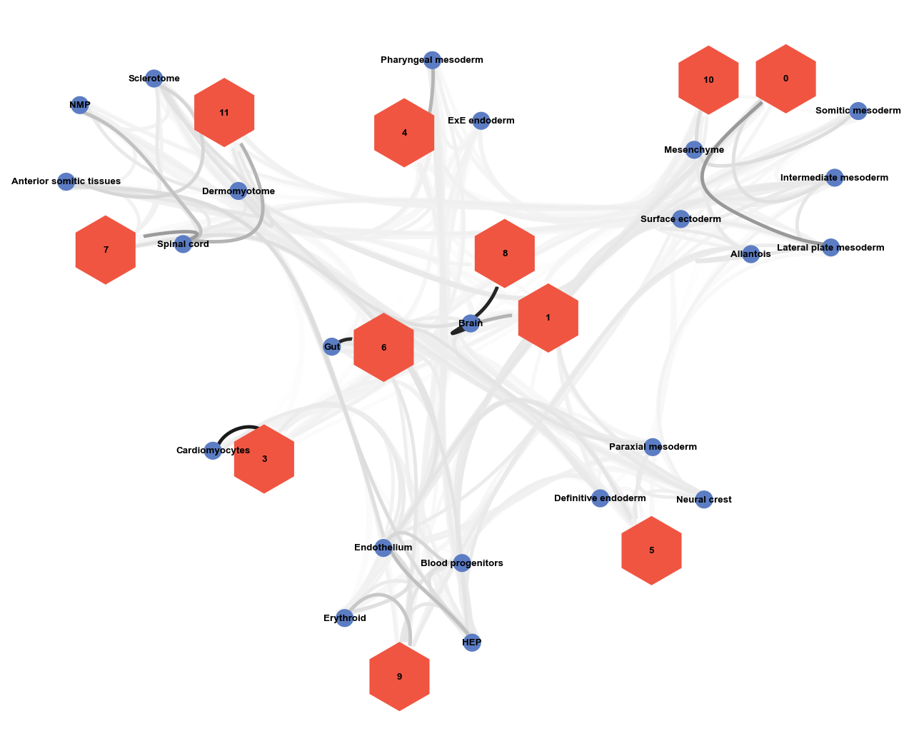
Given this graph, and what we learned about our niches above, we could now start annotating the niches we identified.